
Are We in for a Market Correction?
A growing set of serious valuation metrics reveal a deep disconnect between equity prices and long-term value

Please excuse my absence of notes over the last two weeks, things have been quite busy on my end. This note was started last week, and from the results of the past couple trading days it seems it may be currently in the money.
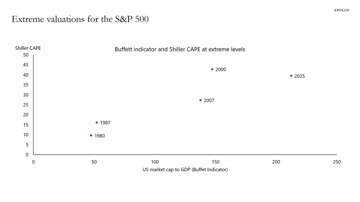
Wall Street CEOs have all been voicing their concerns about the frothy market, and it’s something I have been thinking about (and positioning my portfolio) for months. Torston Slok, Chief Economist at Apollo, plotted the Warren Buffett indicator for overvaluation (comparing US equity market cap to GDP) next to the Shiller CAPE ratio (which is a Cyclically Adjusted PE ratio averaged and inflation-adjusted over the past 10 years).
As a refresher, I discussed the Shiller CAPE and the sky-high valuations for AI in the following note:

AI valuations are surely a large contributor to the overall market’s extreme valuations, but is it the only froth? The following charts from Current Market Valuation show where we are:
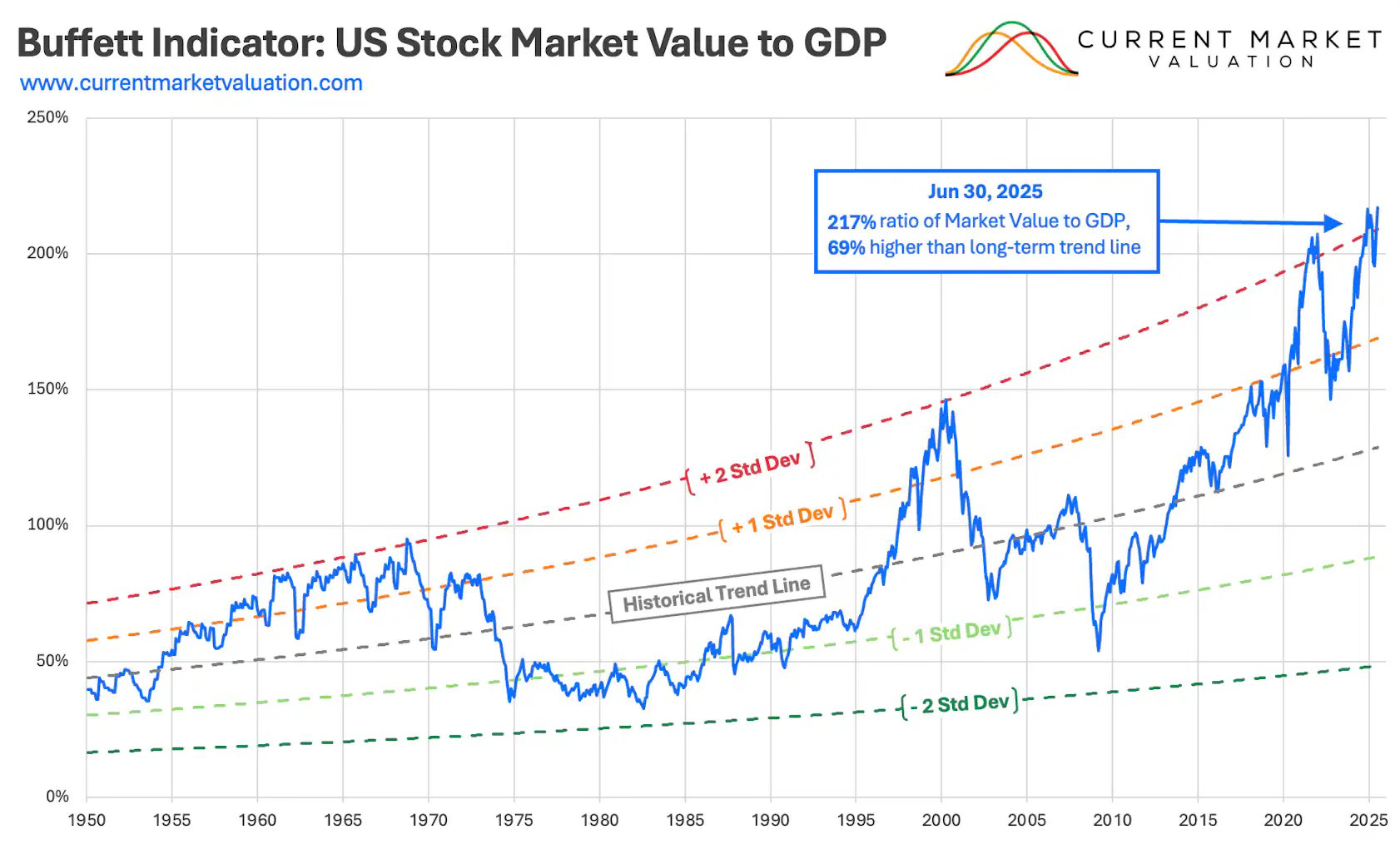
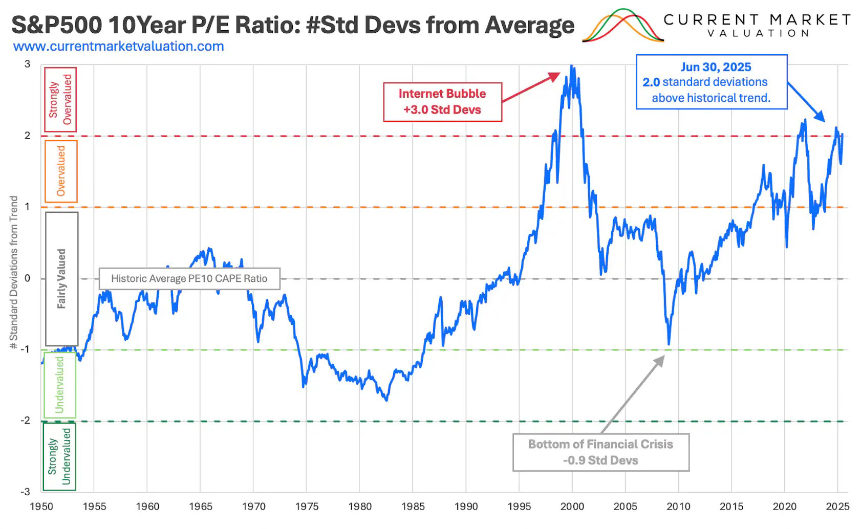
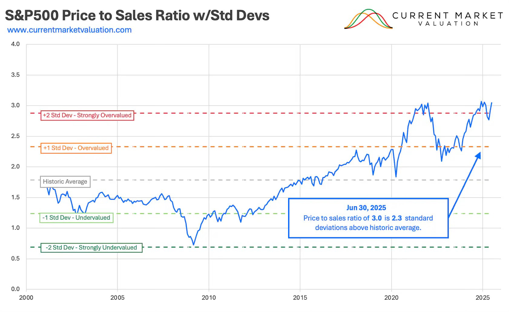
Quick note: The following charts are as of June 30th, 2025 but these are great charts to illustrate where things sit within the historical context. I provide current numbers where available and the story is the same.
Buffett Indicator
Here again, the Buffett Indicator— a ratio that fluctuates over time since the value of the stock market can be volatile, but GDP tends to grow much more predictably— is currently at 217% using market cap and GDP as of 6/30/2025, which is about 68.63% (or ~2.2 standard deviations) above the historical trend line (since 1950), suggesting that the stock market is strongly overvalued relative to GDP.
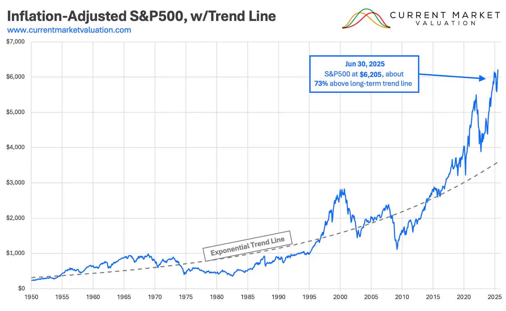
10-Year P/E Ratio
Today, the 10-year price to earnings ratio (aka CAPE) is 39.7x, over 2 standard deviations away from the historical average since 1950 of 20.5x—this suggests a significant overvaluation on an earnings basis. In the chart below, CAPE was 37.1x as of 6/30/25.
Price to Sales Ratio
Another indicator showing strong overvaluation is the price to sales ratio for the S&P 500. As of June 30th it was at 3.1x, vs its average of 1.8x since 2000. Today, the ratio is 3.3x.
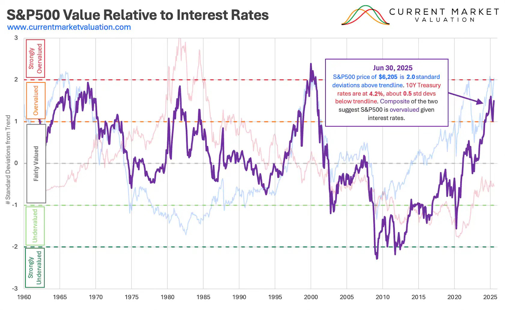
S&P 500 Market Cap Relative to Interest Rates
Today, the 10-year treasury yield is 4.1% (relatively the same since June) and the S&P 500 is 6,735, up 8.5% since June, so the relative value position of the S&P 500 has moved closer to strongly overvalued territory.
Methodology: What this measurement and chart is showing is the composite of the S&P 500 and 10Y Treasury Yields relative position to their long-term trend lines (e.g., the S&P 500 is over 2 standard deviations above its long-term performance average, and the 10Y is 0.5 standard deviations below its average, therefore the S&P 500 is ~1.5 standard deviations above its trend line relative to the 10Y)
Mean Reversion
Statistics teach a basic truth: what goes up eventually comes down. That’s the essence of mean reversion. When the S&P 500 trades well above its long-term trend line, it signals something unsustainable: continued outperformance would require the market to compound at an ever-increasing growth rate. History shows that rarely lasts. Eventually, valuations, earnings, or sentiment normalize, and the index drifts back toward trend. Markets can defy gravity for long stretches, but never indefinitely.
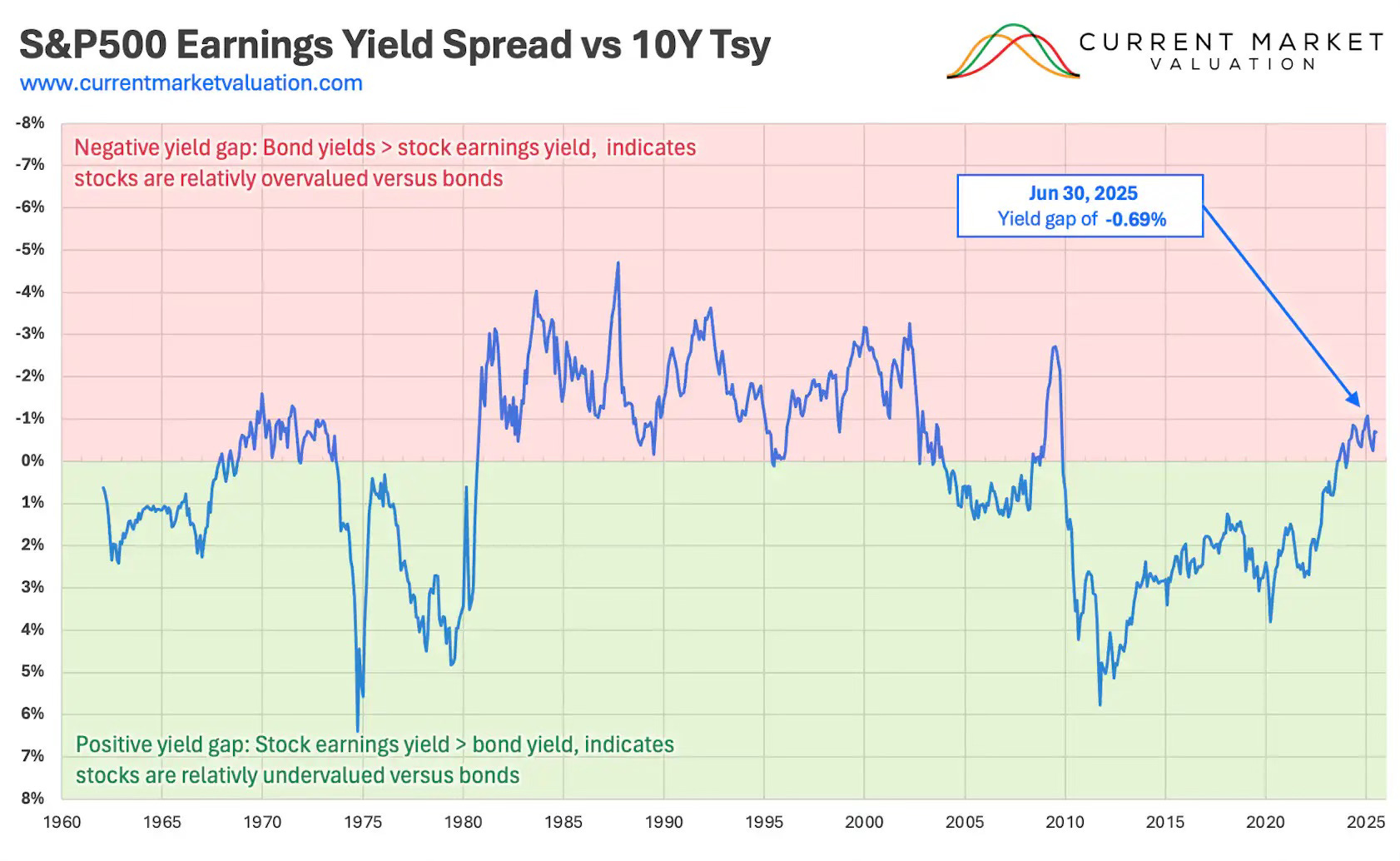
Earnings Yield Gap
Another measure of overvaluation (but caution on this one as there is a lot of nuance) is the earnings yield gap, that is: the gap between earnings yield (the inverse of P/E ratio) and the 10Y Treasury yield. You can look at the earnings yield as an equivalent measure of a bonds interest rate, it’s the rate of return you can expect to earn off your principal (price paid for the stock).
The current gap is -0.81%, meaning stocks are relatively overvalued to bonds but not significantly.
These indicators paint a remarkably consistent picture: valuations across multiple lenses—market cap to GDP, cyclically adjusted earnings, price-to-sales, and relative value to interest rates—are all stretched beyond historical norms. Some metrics are flashing outright extremes, while others, like the earnings yield gap, offer a more nuanced signal. But the broader message is hard to ignore. Markets don’t need an imminent catalyst to correct; they simply need gravity to reassert itself. At these levels, forward returns are mathematically constrained, and the burden of proof shifts squarely onto continued earnings growth and AI-driven optimism. For investors, this isn’t a call for panic, but it is a call for discipline. When valuations sit this far above trend, mean reversion isn’t a risk scenario. It’s a matter of time and magnitude.
Disclaimer
The content provided in this newsletter is for informational and educational purposes only and does not constitute financial, investment, or economic advice. The views expressed are solely those of the author and do not necessarily reflect the opinions of any affiliated organizations or employers.
While efforts are made to ensure the accuracy of the information presented, no guarantee is given regarding its completeness, reliability, or suitability for any particular purpose. Readers are encouraged to conduct their own research and consult with a qualified financial advisor before making any investment decisions.
Past performance is not indicative of future results. All investments carry risk, and the value of investments may go down as well as up. The author is not liable for any losses or damages arising from the use of this content.
By subscribing to and reading this newsletter, you acknowledge and agree to this disclaimer.
Missed the commentary.