
The Fed's Current Predicament
The data behind the Fed's "risk management cut" to rates

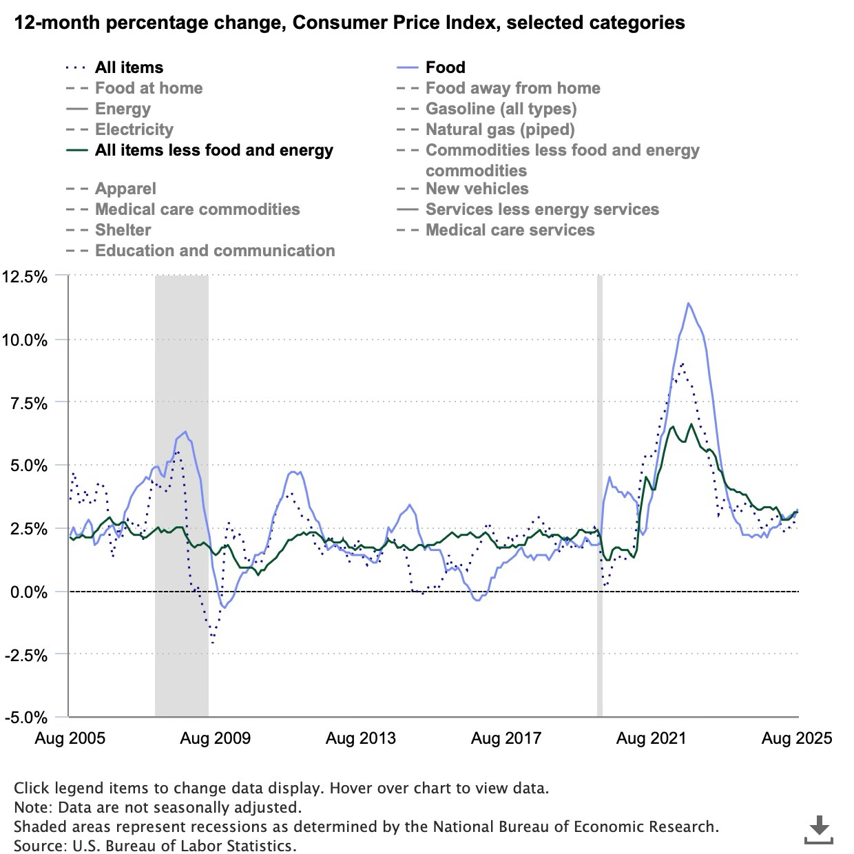
Disinflation has stalled.
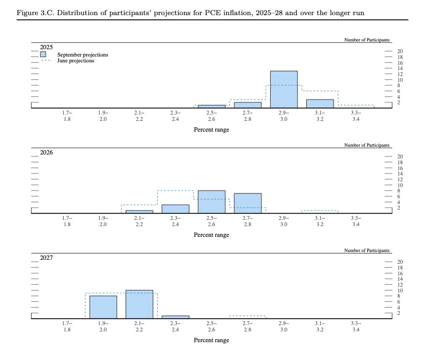
The majority of FOMC members think inflation will remain above the 2% target through 20271
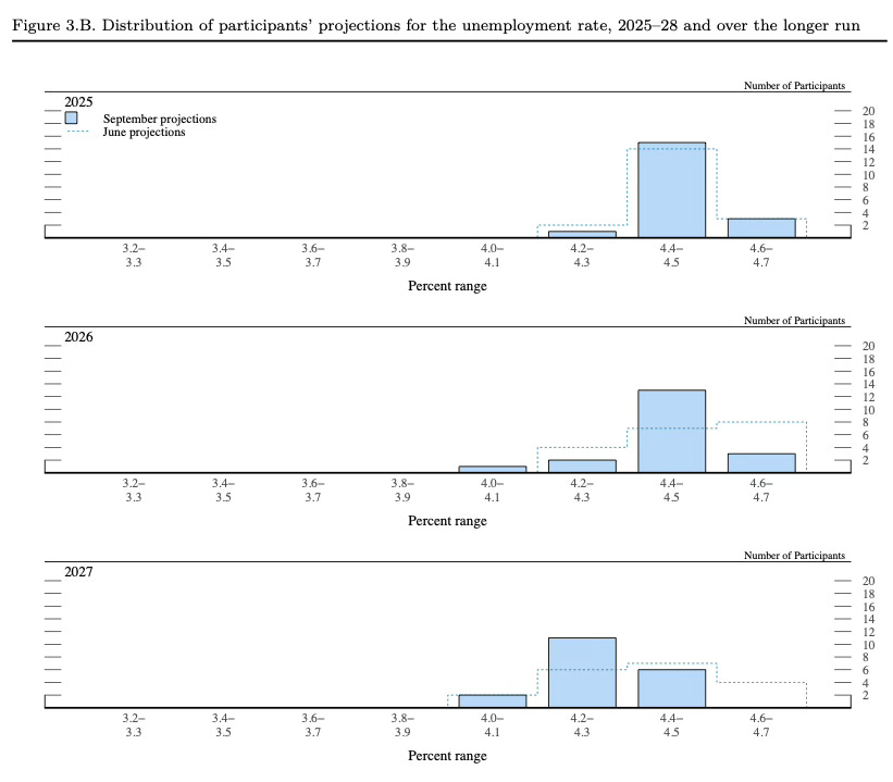
They also see unemployment rising above the current 4.3% in August 20252
This puts the Fed between a rock and a hard place as they manage their dual mandate—controlling inflation and unemployment
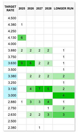
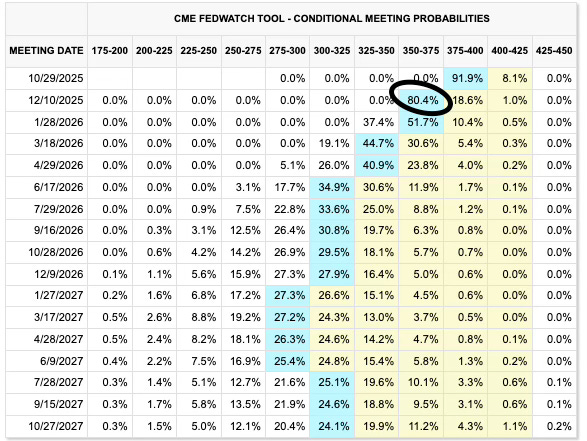
The Fed cut rates by 25bps this week to a range of 4.00-4.25% and according to the dot plot, 9 voting members are forecasting a 3.50-3.75% target range by the end of the year.
The market is expecting the same.
Why did the Fed cut when its own projections point to a prolonged period of higher inflation? It framed the move as a “risk-management cut”—meaning, like any prudent risk manager, it will continue to reassess. The market, however, isn’t pricing in any reversal.
https://www.federalreserve.gov/monetarypolicy/files/fomcprojtabl20250917.pdf
https://www.bls.gov/news.release/pdf/empsit.pdf
Sources: Federal Reserve, CME Group
Great charts and commentary! Do you think the labor market slowdown was enough to warrant a rate cut, or did the Fed cut because of political pressure?